Friday, 13 March 2009

Target audience

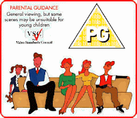
As our opening sequence genre is a "crime caper", we felt that it would not be considered as "universal" but as "parental guidance" or "PG". We believe this as, although it contains some comedy e.g. in the opening scence where Johan steals the wrong painting it also deals with some adult concepts such as robbery and ocassionally contains some mild language.


Labels: ,

Thursday, 5 March 2009

Feedback On Rough Cut


After showing Hannah our 'Rough Cut', she gave us some constructive feedback on how we could improve it for the final cut. Hannah gave us the following advice:
  • Remove any unnecessary background noise such as non-cast members chatting or shouting.
  • To obey the 180 rule.
  • To change some shots in order to achieve smoother continuity.
  • Move the titles so that they are not consecutive.
  • Take out shot which jumps from scene to scene.
  • Take out swearing/unnecessary language.
  • Remove duplicated scenes.
In order to improve our first attempt at the opening sequence, advice and guidance must be taken advantage of.
We're sure that the tips given will improve our final cut and improve our grade.

Labels: , , , , , , , , , ,

Music For Final Cut


After deciding to make our opening sequence a crime caper, we decided the soundtrack needed to have class and style but with an edgy beat to it as well. We felt it was important for the soundtrack to not take itself too seriously, as to take away the whole aura of the genre. We based our soundtrack on the soundtrack of 'Hustle', a popular TV series that is in the same sub-genre as our own film opening.

The music itself, starts off as a lively piece, introducing the beat that will run throughout the soundtrack. The beat is a mix of normal and conga drums, which helps with its lively pace and edgy atmosphere. An 80's style dance synthesizer is then introduced in order to maintain the light-hearted soundtrack whilst introducing the main rhythm. Shortly after this a funky guitar riff is introduced. This gives the stylish sound that helps the listener compare with other soundtracks in the genre. This rhythm continues for a while and then breaks. The music breaks to avoid strenuous repetition.

We are happy with the soundtrack and believe that it is in keeping with the genre and wholly in keeping with the opening sequence.

Labels: , , , ,

Friday, 27 February 2009

Rough Cut Analysis

We have successfully completed filming our rough cut, though we faced some problems which we did our best to resolve. Firstly we originally planned to film in the Fitzwillam Musuem in Cambridge and so we sent an email to the museum asking for their permission to film there. However they didn't reply. So we decided to film on college grounds in the F Block, where we found a large painting which would do the job.

We also decided that as we only filmed in two different locations we had to increase the variation of shots and camera angles, examples ranging from 'POV' to 'over-the-shoulder' shots to provide plenty of match on action. With some clever editing by Ali, Matt and Rob we managed to overcome this problem.

For each scene, we took about three shots, even if we felt the first take was adequate enough. This made the task of editing easier as we could then have a range of angles to choose from.

Labels: , ,

Friday, 13 February 2009

Shot Schedule

1.Shot Framing: Ews(extreme wide shot) This is the establishing shot where it slowly pans forward towards the characters. Action:The three characters Domingo, Alan and Johan. Info: Painting, Costume

2.Shot framing: POV of painting(wide shot). Action: 3 characters looking at painting.Info: Costume. Painting

3.Shot framing: Close up of Domingo. Action: Domingo looks across at Johan with camera tracking across Johan looks happy at painting. Still tracking across to alan whoe's glaring at Alan. Info:costume.

4.Shot framing: Fade out on Johan.Action: Johan still looks happy. Info: costume.

5.Shot framing: Black back ground title name. Action: Title The grifters

6.Shot framing: Black background Bold white writing saying "3 weeks earlier"

7.Shot Framing:
Establishing long shot. Action:3 charcthers around a computer

8.Shot framing: Track and zoom into ransom note

9.Shot framing:Low angle medium close up. Action: How are we going to get 3 000 000 pounds in 25 days. Info costume 2 costume ransom note

Labels: , ,

Thursday, 12 February 2009

Props

Here is a list of props in which we'll need in order to film our opening sequence.;

1. Ransom note containing magazine cut outs of letters (see below).
This one of the main props in the sequence, as it helps develop the narrative as well .


2. Computer and desk on college site.
3. Character's dressed in informal wear (to emphasize professionalism in more formal scenes).

Labels: , , ,

Friday, 6 February 2009

Shot List

The following is a list of shots we will take when making our opening sequence;

1. (After opening credits- Production logo, credits etc.)

2. Long shot, of 3 males (Matt, Ali, Jon) staring at a (covered) painting.

3. Over the shoulder shot of the boys. (literally closer shot of 2.)

4. Point of view shot of the painting on the wall.

5. Close up of the boys reaction as the cover comes off the painting.

6. Panning shot across the boys reaction, from right to left.

7. (Title of the film appears)

8. (3 weeks before appears)

9. Zooming over the shoulder of Damingo (Matt) at piece of paper.

10. Close up of paper, revealing that it is a ransom note.

11. Long shot of two of the lads (Ali and Jon) arriving at the computer that Damingo is sitting at.

12. Over the shoulder shot of the computer, revealing that the computer shows the London Tate web page. (If the shot does not reveal such information to the audience this shot will follow 12; Screen shot of London Tate museum).

13. Close up of Damingo as he gets an idea.

14. Close up of Alan as he gets the idea.

15. Return to close up of Damingo as he says 'I have an idea boys'.

16. Close.

Labels: , , , , ,

Thursday, 22 January 2009

Analysis Of Opening Sequence

As part of our A.S Media project we were required to analyze two opening sequences. As our film is going to be a crime caper I choose to analysis the 1963 classic film "The Pink Panther" as this was one of the first original crime caper movies.

The film begins with when the pink panther diamond was first made. It opens with a young girl been given the pink panther as a gift, from who we assume is her father. The camera then pans forward into the diamond as it is being tied round her neck. The audience is then thrust into this cartoon world where literally a pink panther is shown on the screen. This character is shown inconspicuously moving across screen. Jazz music begins to emphasize the secret nature of the character as he tries to escape from a 'Inspector Clouseau'.

Labels: , ,

Thursday, 15 January 2009

Analysis of Logos


New Line Cinema logo and Warner brothers pictures are both from the time Warner Company. New Line Cinema are in charge of making the film and will continue to produce merchandise to increase profits. This logo has the classic image of the film reel to relate to what it does, allowing everyone to understand what the company represents. The dark background with light behind the main image draws your focus to the centre followed by the titles, this is how the visual hierarchy has been set up to draw your gaze. the only other information is that their part of the Time Warner Company.

Warner brother pictures in a sub division within the time Warner Company. This is known world wide as the trade mark of Warner brothers, the logo its self has clouds in the background giving it its own structure within any commercial branding it is linked to. The gold and blue work together to create an image that is recognised and connotes trust for parents. The image fills the screen leaving no room for anything to take your eye.

Columbia Pictures from Sony Pictures Entertainment, is almost the opposite to the Time Warner Company. The logo is full, it contains a cloud background but is dark as if at sun set taking your attention up the statue towards the shining light in the centre of the word Columbia, the logo was originally created in 1924 and through out the years has slowly changed to what we see today. The logo has only changed to keep modern but keeping it originality so it can still be recognized by an older audience and acts as a symbol for a respectable company. It suggest Columbia are involved with serious films.

Universal Studios is a film making company from Hollywood it is one of the longest running film production companies. It has generally been the same image since 1912 with the image of the globe and the word universal around it. this is sometimes adapted to the film the film that has been created for instance for 'E.T- Extra Terrestrial', it was shown backwards moving away from the earth towards space.

Labels: , , ,